A practical guide to Angular Template-Driven Forms


Intro
In Angular, we have two ways to build forms, which are template-driven and reactive. While both ways are different to use, they're both built on top of a common Forms API.
From the start of my journey with Angular, I've always used Reactive Forms. That's because reactive forms are recommended (sold as more scalable, reusable, and testable) in the Angular docs and because most of the content created by the community is focused on using the reactive way to create forms in Angular.
Until recently, I never looked at template-driven forms. But due to circumstances that have occurred in the same week, I've decided to get more familiar with creating template-driven forms.
The first circumstance was returning to a complex form after a couple of months and having struggles with how the form was set up. Due to these struggles, I experimented with building a layer on top of the Reactive Forms API. While at first, I was pretty happy with the design, the solution was getting worse with every addition. Now that I look back at that proof of concept, I realize that I was building a poor-mans API compared to the API that template-driven forms already provide.
The second circumstance was that Ward Bell was advocating for template-driven forms on a Forms Episode of the The Angular Show podcast.
Watch Ward's talk at ng-conf Prefer Template-Driven Forms
Based on Ward's experience, the examples that were talked about on the podcast (alongside a StackBlitz demo), and my findings while I was attempting to build a layer on top of the Angular Forms API, I'm now exploring and discovering the benefits of the template-driven way.
In this post, I'd like to share my experience with some practical examples. The code used in this guide can be found on GitHub.
Creating a Template-Driven Form
If this is your first time building a template-driven form or if you just need a quick refresher, I would suggest starting by reading the Angular docs. For a more in-depth look at how template-driven forms behave and react, the Angular docs also got you covered at Data flow in template-driven forms.
A brief recap of the docs is that the HTML form entity creates a new NgForm instance (this is a built-in Angular directive, which uses form as the directive's selector). Inside the form, the ngModel directive is used to register form controls to the form instance (under the hood ngModel creates a new FormControl, as we can see in the source code). While adding the ngModel attribute to a control, it's important to also assign a value to the name attribute to correctly build up the form tree. The value given to the name attribute is the property name inside the template model, with the form control instance as the value.
In code, this looks like this.
While the
forattribute of the label and theidattribute of the input control does not affect the Angular form, it's important to link the label to the control in order to make the form accessible.
This form results in the following form value.
To unlock the full potential of template-driven forms, we use two-way binding to bind the template form to a TypeScript (data) model. The TypeScript model is used to process a form submission when a user submits the form, for example, to make a request to a backend. The model can be sent to the backend in its current state, or it can also be translated to a model that the backend API expects.
Because the TypeScript model is coupled to the template model, every change made to the model will also change the value of the template model and visa-versa.
To create a two-way binding we use the banana in a box syntax ([()]), the form now looks like this.
The above template and model result in the following structures for the two models. Notice the difference between the two property names:
formTextfor the template model, because the input hasformTextas the name of the control- and
textfor the TypeScript model, because the model has thetextproperty
| Template Form Value | TypeScript Model Value |
|---|---|
{
    formText: 'some text value here'
}
|
{
    text: 'some text value here'
}
|
Because the structure of the template model and the TypeScript model doesn't need to match, it unlocks significant advantages in comparison to reactive forms, which we will address later in the next sections.
Form Building Blocks
First, we need some basic controls before we're able to construct a usable form. In this section, we'll take a look at how we can create the most common form controls and how its value translates to the two models look like.
Input Controls
The obvious and the easiest controls are the native input controls, these controls are single HTML elements that have a value. To bind the control to the TypeScript model, we can just use the ngModel directive.
Angular makes things easier for us by already parsing the value of the input control to its corresponding type. Angular does this with a couple of directives, more specifically with control value accessors. An example of this is the number input control, the value of the number control (a string) is parsed to a number by the number value accessor.
| Template Form Value | TypeScript Model Value |
|---|---|
{
    formText: 'hello',
    formNumber: 5
}
|
{
    text: 'hello',
    number: 5
}
|
Select Element
While the HTML select element doesn't have a value attribute, we can still use the ngModel directive to bind the select element to the TypeScript model.
To assign values to the option elements, the value attribute is used on the options.
These options can be static or can be iterated over by using the *ngFor directive.
The value of the selected option is used as the value of the TypeScript model. When the TypeScript model has an initial value or when it's reassigned a new value, the corresponding option will be selected automatically in the template.
| Template Form Value | TypeScript Model Value |
|---|---|
{
    formSelect: 2
}
|
{
    select: 2
}
|
Checkbox List
For my checkbox lists I like to include the checkbox items in the TypeScript model, and add a selected property on the items to know which checkboxes are selected (checked). In the template, this selected property is bound to a checkbox control with the ngModel directive.
All checkbox elements within the same group must have unique names, otherwise, all the control will share the same form control instance, and thus the same value.
| Template Form Value | TypeScript Model Value |
|---|---|
{
    formCheckbox-check-one: false,
    formCheckbox-check-two: true,
    formCheckbox-check-three: true,
}
|
{
    checks: [
        {
            id: 'check-one',
            label: 'Check One',
            selected: false
        },
        {
            id: 'check-two',
            label: 'Check Two',
            selected: true
        },
        {
            id: 'check-three',
            label: 'Check Three',
            selected: true
        }
    ]
}
|
In the example above, the checkbox values are represented in a flat object structure. While this is enough for the simple cases, we can also reorganize the structure of the template model by creating nested objects. Because the template model doesn't need to reflect the TypeScript model, it allows us to be flexible with the structures we use to shape the form.
This allows us as developers to model the template as efficiently as possible for certain use-cases. I find it easier to group the checkboxes in a nested hierarchy to make it effortless to validate the checkbox group, e.g. when at least one checkbox needs to be checked.
The snippet below uses the ngModelGroup directive to group the checkboxes. Behind the scenes, Angular creates a new FormGroup instance and adds a new leaf in the template model with the given name.
This change doesn't impact the TypeScript model and is purely a change to the template model to make it easier to use, for example it becomes easier to validate.
This change leads to the following structures of the template model and the TypeScript model.
| Template Form Value | TypeScript Model Value |
|---|---|
{
    formCheckbox: {
        check-one: false,
        check-two: true,
        check-three: true
    }
}
|
{
    checks: [
        {
            id: 'check-one',
            label: 'Check One',
            selected: false
        },
        {
            id: 'check-two',
            label: 'Check Two',
            selected: true
        },
        {
            id: 'check-three',
            label: 'Check Three',
            selected: true
        }
    ]
}
|
Radio Group
A radio group is similar to a checkbox list. The difference is that in contrast to a checkbox list, radio buttons that belong together need to have the same name. If this is not the case, the form creates a new form control instance for each radio button with a different name. Because the radio buttons are linked to the same TypeScript model value, the radio buttons all have the same value and will all be updated when another radio button is selected. While the TypeScript model will have the correct value, this might be confusing on the side of the template model and might cause problems in the future when it needs to be validated.
| Template Form Value | TypeScript Model Value |
|---|---|
{
    formRadioGroup: 1
}
|
{
    radio: 1
}
|
Forms Controls Example
To play around with the form controls and see how changes reflect on the template model and the TypeScript model, you can take a look at the following StackBlitz.
Validators
Validation with template-driven forms is done by adding attributes (directives) to a form control. This makes it feel like you're using the Web platform, which is always pleasant.
I can highly recommend Kara Erickson's talk Angular Form Validation to get a better understanding of Angular validators.
Built-in validators
The Angular FormsModule comes with a set of directives that implement the native HTML form validation attributes.
The
minandmaxvalidators to validate numeric inputs were implemented in Angular v12.0.0, the next releases also contained small bugfixes and enhancements.
except for the min and max validators. Recently, a Pull Request was merged, so I assume that these missing validators will be available in one of the future releases.
Dynamic Validators
To make the validators dynamic, the static value of an attribute needs to be replaced with a component variable. When the value of the variable changes, it re-triggers the validator with the new value.
Because the validator revalidates, it's effortless to create dynamic and conditional validators.
For example, to make a field required based on another form control, we bind the value of the second control to the required attribute. When that value is truthy, the control is required, otherwise, it isn't required. In the following snippet, the name control is required when the checkbox makeNameRequired is checked.
Depending on the desired user experience, hiding the control (by using the *ngIf directive) or disabling the control (with the disabled attribute), also removes all of the validators of the control.
Custom Validators
While the built-in validators are providing a good starting point and are sufficient for basic forms, we need to write custom validators that fit the specific needs of our forms.
To create a custom validator we must create a new Angular directive, implementing the Validator interface(1). The validator also needs to be registered to the Angular validators, therefore we register the directive to the Angular validators (NG_VALIDATORS) (2).
As an example, I've created the RequiredCheckboxGroupValidatorDirective validator.
This validator requires that at least N checkboxes need to be checked inside a checkbox group.
A best practice is to extract the validate method out of the directive, and to define it as a stand-alone validator function (ValidatorFn). The gained benefits are that the logic inside the validator is easier to test and that it's now possible to reuse the validator in a reactive form.
The validate method needs to return a null value when the value of the control is valid.
Otherwise, if the value is invalid, the validate method needs to return an ValidationErrors object with (details of) the validation errors. The returned details will be used to create user-friendly Validation Messages.
To use the RequiredCheckboxGroupValidatorDirective validator, we can now append the directive to a control, or in this case to a model group.
In Validation Messages, we'll see how we can transform this object into human-friendly messages.
You can also create a generic validator directive to validate most of your logic without the required setup.
Revalidate Custom Validators
There's one problem with the current version of the validator. To set the minimum required selected checkboxes, the RequiredCheckboxGroupValidatorDirective validator uses the requiredCheckboxGroup input property, but the validator doesn't revalidate the validity of the checkbox group when the value of the requiredCheckboxGroup input property changes.
To trigger the validator when the value of an input property changes, we need to make several changes to the directive:
- register a change handler with the
registerOnValidatorChangehook (1) - create a getter and a setter for the input property (2)
- invoke the change handler when an input property receives a new value in the setter (3)
To give another example, let's take a look at another widely used validator is a comparison validator to compare two values, for example to validate the values of two input controls e.g. password and password confirmation.
Async Validators
To validate form controls require an HTTP request to be validated, we need to create an asynchronous validator. The async validator almost looks identical to a synchronous validator, with subtle differences:
- the validator needs to be provided to the Angular asynchronous validators,
NG_ASYNC_VALIDATORS(instead ofNG_VALIDATORS) - the validator needs to implement the
AsyncValidatorinterface (instead ofValidator) - the validate method needs to return an Observable containing the
ValidationErrorsornull. It's important to know that Angular expects that the Observable stream completes at some point.
Using the asynchronous validator isn't different from using a synchronous validator, we can just add the directive to a control.
A common pattern with asynchronous validation is to use the ngModelOptions configuration to trigger the validators when the user leaves the input control, and not on every change.
Nice to knows
- An asynchronous validator is only invoked when all the synchronous validators of that control are valid
- While an asynchronous validator is pending, the state of the form control (and the form) isn't
validnorinvalid, but the control is given thependingstate
Testing Validators
Simple validators can be tested by just putting the ValidatorFn method under test, and this might also be a good start for the more complex validators. But to test the revalidation behavior we need to write a test that uses the DOM.
To write this test we can create a host component that "hosts" the directive by using the regular Angular TestBed, and this works fine, but... I like to use Angular Testing Library because it removes some of the setup (e.g. I don't need to create a host component, nor do I have to trigger a change detection cycle), plus I also use the Angular Testing Library to test my components.
In the following two tests, we verify that the EqualToValidatorDirective directive (written in Revalidate Custom Validators) has the expected behavior. Therefore,
- the first test verifies that the control is valid when the input control has the same value as the comparison value,
- while the second test verifies that the validity of the control gets revalidated when the comparison value changes
Validators Example
The examples that we created in this section are available in the following StackBlitz.
Form Errors
In this section, we're going to take a look at how to translate the validation errors to create human-friendly messages, and how to show and hide these validation messages in our forms. But first, we need to get familiar with the states of a form control.
Control States
The most obvious state of a form control is the status property. The value of status can be one of the following, 'VALID', 'INVALID', 'PENDING' (while an async validator waits on a result), or 'DISABLED'. You can also use the shorthand properties valid, invalid, pending, and disabled, which are all booleans.
Other useful states are pristine and its counterpart dirty. These two states mark a control when its value has been changed by a user. The control starts in the pristine status and when the user changes its value, the state of the control transforms to dirty. Both properties are also booleans.
The last two useful states are untouched and the opposite, touched. When the user leaves a control (this triggers the blur event), the status of the control is updated from untouched to touched. Again, both properties are also booleans.
The same states are also available on form groups (NgModelGroup) and forms (NgForm). A form also has a submitted property, which becomes true when the submit event is triggered.
CSS Classes
All control states have an equivalent CSS class.
To obtain the class of a state, simply prepend the state of the control with ng-.
This results in the following class names, .ng-valid, .ng-invalid, .ng-pending, .ng-pristine, .ng-dirty, .ng-untouched and .ng-touched. The release of Angular v12.1 introduced the .ng-submitted class, which is added to the form after a form submission.
These class names can be used to style the control field of our forms. For example, to change the border color to red when an invalid control is touched by the user, we can use the following styles.
Disabled State
A form control can be disabled by adding the disabled attribute to the HTML element.
When a control is disabled, its status will be changed to DISABLED.
As a shortcut to check if a form control is disabled, we can also use the disabled and enabled properties.
It's important to know that if a control is disabled, all the validators of that control are also disabled and the value of the form model will be equal to undefined.
Validation Messages
Now that we understand the basics of the different form control states, we can start the implementation to show validation messages to our users.
Control Errors
All the results of the validators are added to the errors property of the form control instance.
This errors property is an object, a key-value pair where each key is the name of a validator and the value contains the error details.
Be aware that errors is null when the form control is valid.
For example, for our custom validator RequiredCheckboxGroupValidatorDirective, the error key is requiredCheckboxGroup, and details contain the number of required checkboxes.
To help users to fill in the form correctly, we need to translate the error details into a user-friendly message. A naive implementation might look like this. Notice that the messages are hidden until the control is touched by the user, and of course only when the control invalid.
While the above solution works for simple projects, this doesn't scale in larger projects because it has some problems:
- the solution is brittle for changes, we have to manually add and remove validation messages when the validation logic of a form control is changed.
- it will lead to a bad user experience, 1) the wording of the messages won't be consistent, 2) the criteria when a message is shown is different depending on the developer who wrote the form
- creating or updating a new form will take a longer time because the form needs to be manually tied together, which also needs to be tested
To obtain a better experience for our users, we have to come up with an abstraction layer(s). This extra layer will do two things:
- the result of the validator(s) are mapped to a validation message
- the layer determines when the message appears
If we build the layer correctly, it would be possible to use these two features independently of each other. While this might take some time, it will drastically improve the time it takes to develop and maintain forms in the long run. Luckily, there are already some battle-tested libraries available, Angular Material and Error Tailer by ngneat.
To give us a better understanding of the internals of such a validation layer, we're building the different pieces of the layer ourselves. This solution is based on a similar custom-made solution that fits our specific needs.
Configuring Validation Messages
The first step towards reusable validation messages is to create a coat rack to hang up message templates.
We do this by creating a new InjectionToken called VALIDATION_MESSAGES.
Later on, we use the provided templates to build the validation messages.
To configure a message template, we provide the template as a factory function for each validator.
While we're configuring the Angular Modules, these templates are provided via the VALIDATION_MESSAGES token.
For the built-in Angular validators, I like to provide these message templates in a central module.
For the custom validators, I provide the message template in the same module wherein the validator is declared. To know the benefits of this practice see Single Component Angular Modules and Component Tests go hand in hand.
Validate Pipe
To transform the form control errors to a validation message, we create a new Angular Pipe named ValidatePipe. I like to use a pipe for this, just because the pipe doesn't contain any markup which makes it reusable in multiple cases.
To assemble the message, the validate pipe needs to have access to the coat rack of validation message templates. To make these templates available in the validate pipe, the VALIDATION_MESSAGES token is injected into the pipe.
Next, the form control errors are passed to the transform method of the validate pipe and the corresponding message templates can be looked up by using the error key and the injected messages. When the message template is found, the method is invoked with the error details.
This implementation of the ValidatePipe pipe doesn't show all the validation messages, just the message for the first error.
When an error isn't configured, a default validation message is returned.
We can now perform the first refactor to the initial implementation and replace the inline messages in the template with the validate pipe.
This change ensures that the same validation messages are used throughout the whole application. Because the validation messages are centralized it's also easy to change a message at a later time.
Error Component
To make sure that all the validation messages look and behave the same way, we need to create a component, ControlErrorComponent.
The component is in charge of two things:
- it determines the markup and style of the message,
- it controls when the validation message is visible
In the template of ControlErrorComponent, the errors are shown when a control is invalid and if it's been touched by a user.
To render the validation message, the validate pipe is used (created in Validate Pipe).
After the second refactor, the snippet now uses the ControlErrorComponent component instead of the *ngIf directive in the original snippet.
The abstracted ControlErrorComponent component has the benefit that there is a uniform design and behavior, leading to a better user experience. From a technical perspective, we're protected against future design changes because we'll have to change the design only once.
Error Directive
The current implementation requires that the ControlErrorComponent component is added to a form control in order to show the message.
To solve this problem, we're introducing a new directive called ErrorDirective.
The job of the error directive is to dynamically render the ControlErrorComponent when a form control (or a form group) is rendered.
The way that the directive is written, the error component is added to the DOM under the input element.

This works fine for the simple controls, but it's causing troubles for form groups and checkboxes because the error might be shown in between multiple elements.

To fix this behavior, we create a second directive called FormFieldDirective.
The idea behind this directive is the same as the ErrorDirective directive, but instead that the validation message is added after form control, the message will be appended to the bottom of the form control's container.
To use the form field directive we have to add the formField attribute to the form control container.
We could also use the ControlErrorComponent like before, but I find this solution to be more in-line with the ErrorDirective.
After the last refactor, we don't have any code in our forms to display the validation messages.
Form Helpers
So far we're only marking the invalid form controls and are only showing validation messages when a user has touched the form control. But the user also expects feedback when she submits the form.
To implement this feature, we have options.
The first one is to add a new condition to the Error Component and check if the form has been submitted by using the submitted property on the form. Besides this, to add the red border color to invalid controls, a submitted class should also be added to the form. That's why having a .ng-submitted class would be useful, sadly this is not (yet?) the case.
Angular v12.1 adds the
.ng-submittedclass to the form element automatically when the form is submitted.
The second option is to touch all form controls when a user submits the form.
To touch a form programmatically, invoke the markAllAsTouched method on a control, or on a form (group) to mark all controls of that form as touched.
Errors Example
A demo about form control states and validation messages can be found in the following StackBlitz.
Dynamic Forms
To my surprise, creating dynamic (nested) forms with template-driven forms is straightforward. I say this because this was always something that I've trouble with when I was using reactive forms.
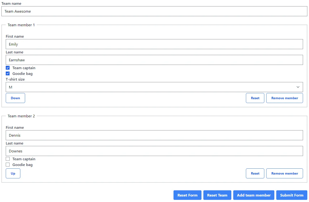
Let's take a look at the following example to create a team and add, remove, and reorder team members dynamically. To give you a better idea, the team form looks like this.
The code snippet below is trimmed down to only contain the basics, the key features are highlighted and will be discussed afterward.
In Creating a Template-Driven Form, we've already learned that the form in the DOM is a representation of the TypeScript model.
That's why we can simply iterate over a collection of our model to create a nested form and bind the properties of the items to form controls by using two-way binding.
Every mutation made to that collection (model.members in the example) will immediately be applied to the DOM structure.
To mutate the collection variable, we can use one of the Array prototype methods or reassign the variable to a new value.
Nested Forms
The template used in the example form uses a flat form model structure, but the (nested) form could also be rewritten as a nested form model. This isn't required, but it has advantages that might be useful in some scenarios.
One advantage is that because a nested form is a FormGroup, you can use all its features. For example, the reset method to reset all the form controls of the form group to clear all of the form control values, this reset is also reflected in the TypeScript model.
Another advantage is that you can add a validator to the form group. While this is also possible with a flat structure, it requires more effort to add the validator.
To convert a flat form to a nested form, you need to wrap the form controls with a parent element that has the ngModelGroup directive.
In the example below, the ids of the team members are used as form group keys to distinguish the multiple team member form groups. The example also adds an extra members group around the team members to be able to reset all the team members at once.
Dynamic Nested Forms Example
The full example can be found in the following StackBlitz. The example also includes the code to reorder the team members and extra validation.
Sub-Form Components
So far, we've only seen a form that is hosted in a single component. This practice is not always convenient, and it might be better to extract some logic by splitting up the component. You refactor the component when it becomes an unmanageable mess or when a part of the form needs to be reusable.
That's where sub-form components come into play, and there are two different solutions to create these.
The best resource out there about advanced form topics is the talk Angular Forms by Kara Erickson.
Injecting the Control Container
The simplest and fastest solution is to pass the ControlContainer from the parent component to the sub-form component. As the name ControlContainer implies, it's a container that serves to group multiple form control instances. Both NgForm and NgModelGroup are control containers.
To make the parent's form accessible in the sub-form, you must inject the control container as a view provider in the sub-form component.
Because the sub-form can be a child of a form or a model group, you have to use the correct parent instance. This makes the sub-form component not as reusable as we'd hoped because we don't know if the sub-form will be used as a child of one of the two parent containers. In an ideal world, we want the sub-form to be used in both cases.
A less brittle solution is to always provide the correct control container (duh...!).
To do this, we can reuse this snippet that I took from Ward Bell.
The formViewProvider always returns the proper parent instance. The provider first tries to return the NgModelGroup but falls back to a NgForm if the NgModelGroup does not exist.
Which is used in the sub-form component.
Once the control container is injected, you can continue to create the form in the sub-component.
As an example, take a look at the refactored version of the team form. In the example, the team members are extracted into a team member sub-component.
The team member component looks like this. As you can see, besides injecting the control container, this solution doesn't change how (sub-) forms are built.
Control Value Accessor
While the control container approach is simple, it isn't as robust as a Control Value Accessor (or CVA in short).
The control container ties the sub-form specifically to template-driven forms. This isn't a big deal if your team only uses template-driven forms, but it might be a problem when your components are shared across multiple teams, which might use the reactive forms API.
Another benefit of Control Value Accessors is that a Control Value Accessor can also be implemented as an Angular directive.
Depending on the project you're working on, these benefits don't outweigh the extra complexity of a Control Value Accessor.
To create a Control Value Accessor you must implement the ControlValueAccessor interface.
I won't go into the details of Control Value Accessors, but here's how a simple typeahead implementation looks like.
To register the Control Value Accessors, you must provide the component or directive to the NG_VALUE_ACCESSOR multi-token.
The component or directive, provides an implementation for the writeValue, registerOnChange, registerOnTouched, and optionally setDisabledState methods from the ControlValueAccessor interface to bind the Angular API to a DOM element.
Next, you can consume the Control Value Accessor as you would with a native/Angular control.
Meaning that you can simply add the ngModel attribute to the Control Value Accessor.
Sub-Form Components Example
As always, the example of this section is also available as a StackBlitz project.
Testing Template-Driven Forms
It's often said that template-driven forms are hard to test, and that it's easier to test reactive driven forms. This claim depends on what your understanding is of a test, and how you test a form.
The difference between the two kind of forms is that a reactive form can be tested without that you have to interact with the DOM, you can manually set form values with the reactive API. With a template-driven form, you can't do this and you are obligated to test the form by interacting with the DOM.
For me, I want to test the form like a user would fill in the form. This means by interacting with the DOM. This practice makes sure that the template is correctly connected with the form model, and gives me confidence that the form is working as expected.
At the project I'm working on, we switched from reactive driven forms to template driven forms. Because the tests were written like this, the switch between the two syntaxes didn't affect the tests. The result was that we were confident to ship the new refactored forms, using the template-driven syntax.
To test forms, I like to use the Angular Testing Library (I may be biased because I'm the maintainer of the library). I like the simplicity to render forms, and I like the API because it's intuitive to use.
As an example, let's fill out a simple form by using the Angular Testing Library. To know more about testing Angular component, take a look at my other articles about this topic.
Conclusion
As you can see, you can do everything with template-driven forms. Speaking from our experience, we ended up with less code to maintain after we migrated some of our bigger forms to the template-driven API. My opinion is that template-driven forms, the easy and also the complex ones, are also easier to write and to understand. This is certainly true when the person is new to Angular Forms. And don't worry, you will still "be reactive" as the template itself is reactive by nature.
All the examples used in this article can be found on GitHub.
Didn't find what you're looking for? Feel free to reach out to me on Twitter
Incoming links
Outgoing links
- Single Component Angular Modules and Component Tests go hand in hand
- A generic Angular template-driven validator
- A new way to validate Angular Forms
- Good testing practices with 🦔 Angular Testing Library
Feel free to update this blog post on GitHub, thanks in advance!
Join My Newsletter (WIP)
Join my weekly newsletter to receive my latest blog posts and bits, directly in your inbox.
Support me
I appreciate it if you would support me if have you enjoyed this post and found it useful, thank you in advance.
